As promised, here is my review!
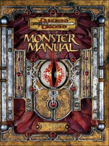
This review of the Pathfinder Bestiary (PFB) is going to be a hodgepodge of different aspects. I want to give my opinion on the PFB, while comparing it to different aspects of the Dungeons and Dragons 3.5 Monster Manaul I (MMI)
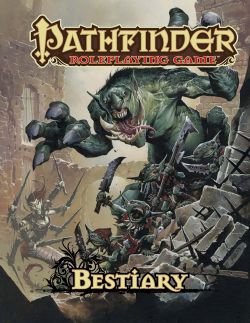
The art and production of the book are top-notch. The art is high quality and some of them have a definite anime influence. The pages are high gloss with great font. I love the Cover Art. A bunch of ravenous little goblins running in front of a beserking troll
The layout of the monsters is much better and easier to read. The spell layout for the different creatures and the listed DC for each is a breath of air compared to MMI. I think that once you get used to the slight change of layout, your eye follows the progression much quicker, and it is harder to get lost if you are using it as a source for random encounters.
Another great part of the PFB is the monster icons. These icons are described at the beginning of the book. Next to the name of each creature several icons symbolizing the creature type, terrain, and climate. Very handy quick reference when looking for appropriate encounters for your campaign.
Of course there are several new monsters in the PFB that weren’t in the MMI, like the new celestial race Azata, the Dark Creeper and Dark Stalker, Shadow Demon, and Morlock. There are also quite a few more Genie types than in MMI and the Chained Devil (Kyton) is a devil no more. There is now also a sub-type of Dragon, the wingless ones, called Linnorm. Very cool.
There are also, sadly and understandably (damned copyrights) monsters missing from the PFB there were in the MMI. Regular staples like Beholders, Githyanki and Githyazari, Grimlocks, Mindflayers, and Umber Hulks are all absent.
The one thing I can say I’m not too impressed with is the abundance of “regular” animals and creatures in the main part of the book. This space should have been used for other fantastical creatures. I think that PFB should have borrowed from the MMI and had the “regular” animals in a section in the back (pictures welcome).
My other complaint, and again this is minor, is having all the dire creatures grouped together, as was the case in MMI. In PFB you have to flip to the creature that has a dire sub-type as well; bear, boar, hyena, etc. Again, this is a minor complaint.
The appendix in the back of the book are awesome and full of information and really handy. The best is the Creature Type Appendix with bulleted break down of what each type gets, and then goes further by breaking down with subtypes.
Alright now I figured for kicks I would point out art that I liked and disliked in the book. Please remember that this my opinion so if I offend.. sorry, but that’s the breaks.
Not All Artists Are Created Equally
Now almost ALL of the art in PFB is amazing, but one artist, Andrew Hou, I found mostly lacking with his art. No I can’t draw better than him, no I’m not as talented as him, but I still don’t care for much of his art in the book. There… I said it.. Moving on..
*The Bad* (and sadly most of the bad falls into AH’s work)
Ankleg– I like it on some level, but there is also something I don’t like about it. MMI= Better art.
Basilisk– Not too crazy about this one. It looks just like a giant lizard and not a vicious beast. MMI= Better art.
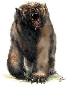
 The awesome Dire Bear from MMI.
Dire Bear– This is honestly my LEAST favorite piece of art in the book. The bear looks like it is getting stick shoved up its pooper.. Poor baby. MMI= WAY Better art.
Doppleganger– Not really sure what effect the artist is going for on this one, but apparently it is lost on me. MMI= Better art.
Ettercap– Looks like something from Killer Clowns From Outer Space. MMI= Better art.
Glibbering Mound– Hrm…. About all I can say. MMI= Better art.
Griffon– Looks disproportionate, does not capture the regal majestic look of the beast. MMI= Better art.
Hobgoblin– Definitely looks like a more evolved goblin, but I don’t find them as threatening as in MMI.
Minotaur– The MMI Minotaur looks way more savage and feral.
Nighthag– Blah. The picture looks like a cross between a Drow and a Tiefling. MMI= Better art.
Nightmare– Meh.. About all I can muster. MMI= Better art.
Satyr– I can’t even describe this lack luster piece. MMI= Better art.
Giant Slug– Not in MMI. Not a great drawing, but it is humorous.

*The Good* You knew there had to be some!
Animated Objects– Great pic, doesn’t look like a demented Lumiare (Disney Beauty and the Beast).
Behir– Makes the best look way more challenging.
Bulette– Love the detail of this pic.
Cloaker– Now I would be afraid to tangle with this beasty.
Darkmantle– Love the new version.
Balor (Demon)– The detail in the pic is awesome
Dretch (Demon)– Looks far more deadly for a CR 2 creature than its predecessor in MMI.
Devourer- I find this one more deadly and less cartoony.
Dragons- All look simply amazing. Although I do wish there was more on each dragon that a tiny little blurb on each.
Drider- Looks way better than MMI.
Ettin- Crisper features, more threatening. Still love MMI too though.
Gnolls- Look great!
Goblins- Love the new look of goblins like possessed Gremlins.
Harpy- God. So much better than MMI.
Homunculus- Love it!
Lich- Looks pretty good. MMI Lich still is my favorite though.
Lizard Folk- Looks savage, agile, and really captures the essence of the creature.
Lycanthrope- Wererat and werewolf look amazing. I would have liked to see a werebear though.
Mephits- Cute. They remind me of something from Labyrinth.
Ogre- Looks good. Point for Andrew Hou.
Orc- There is definitely some WOW influence here. The pic does look amazing though. Better than MMI.
Otyugh- Creature looks so much more deadly and detailed than in MMI.
Remorhaz- Terrifying.
Salamander- More demon looking.
Rust Monster- Oh baby.
Sahuagin- So much more detailed than in MMI.
Sphinx- Way way way better.
Troglodyte- Wicked, love the change.
Troll- Looks like a creature that could fuck the party up.
Wight- Good pic- Humorous at the same time.
Wraith- Grat pic! Totally menacing and deadly looking.
Xill- Oh so much better.
In Conclusion:
Overall I think that the PFB wins out over the MMI. My heart does have some attachment to many of the drawings in MMI since I have now spent many a year staring at them and figuring out what ones to throw at my players just to mess with them (evil grin).
I think that the art, for the most part is crisper and more detailed. The layout is better and easier to follow. Overall I really love this book and am happy I got my copy so soon!
It is worth the price tag of $39.99 or $9.99 for the PDF. Honestly you can’t beat that! It has links throughout the PDF, one click and BAM you are at your monster!
Or if you want a cheaper deal, you can order through Amazon. The book is only $26.39 and FREE shipping!
If you are a fan of Pathfinder or 3.5 this book is worth it!
I have ordered the PF Core rule book, i eagerly await until my coffers can afford the beastiery. I liked your review it has helped convince me on getting it. Thanks!
-misterecho
http://www.new2rpg.wordpress.com
I’m glad I could offer up something worthwhile:) Thanks Misterecho. If you have any questions on the book, just let me know. You won’t be disappointed with the Core Rule Book at all. It’s a great thing to own!
I agree with much of your critique of the art in the PFB, although I would add one more artist that I didn’t care for, Eric Lofgren. He only did the cockatrice and tarrasque art and both illustrations were close to brilliant, but I feel like squinting when I look at them. They seem just a hint out of focus. I don’t know if it was intentional or some artifact of the reproduction process, but it annoys me.
My mistake, Lofgren also did the Dark Creeper and the Dark Stalker.
Yeah I’ll agree with you on that. I did find that the Tarrasque was a bit lacking.. I mean it is ok… but I felt that there was just something missing from it. I really didn’t care for Dark Creeper much either. I liked Stalker and the Cockatrice though.. So he’s got a 50% approval rating 🙂
Nice review, Wrath. I am simultaneously disappointed with how many pieces of art you liked better in the MMI, but also stoked to get my copy (just shipped today from Amazon! Woot!)
I wouldn’t normally bring this up here, but I see no other way of reaching you. I’m about to release my first RPG product and I’d love it if a fellow pathfinder/3.5er would be willing to take a look at it and maybe write about it? Drop me a line at my email address (rpg_ike@unnatural20.com) if you’re interested. Thanks in advance either way!
I’m not a PF player so I’ve got a question – what’s the difference exactly in the way PF does monsters and the way 3.5 did them?
Fair enough Nick. I should have covered that in greater detail, and I apologize for not doing so. Tomorrow I shall do a small post on the layout differences. I’ll build a small example monster template, if it’s not sloppy looking ;).
It wasn’t supposed to be a criticism – I don’t think there’s any need to explain standard mechanics in a review of a supplement to a game (as opposed to a core book). But if you did that write up that would be great.